Managing environmental data is a complex endeavor that requires diligent oversight, immediate response to critical events, and the ability to swiftly assess and communicate trends to stakeholders. Without effective visualization, professionals risk being buried under a mountain of raw data, struggling to extract meaningful insights.
This is where EQuIS® Enterprise dashboards prove invaluable. A well-constructed dashboard consolidates vast datasets into a single, dynamic interface, providing real-time visual insights to drive informed decision-making. Instead of sifting through fragmented reports and tables, environmental managers can access all relevant views in one streamlined workspace—eliminating noise, prioritizing actions, and maintaining project efficiency.
Dashboard Benefits: Clarity, Efficiency, and Proactive Management
Much like a car’s dashboard presents essential metrics—speed, fuel levels, engine temperature—an environmental dashboard offers critical visibility into key data points, ensuring swift recognition of potential risks. You don’t need to monitor every detail constantly, but you must act immediately when an anomaly demands attention.
A robust EQuIS dashboard serves as a command center for environmental oversight, empowering professionals to monitor, analyze, and react in real time. With custom alerts, threshold notifications, and automated reports, teams can preemptively address developing concerns rather than reactively managing crises. The result? Better informed decisions, faster response times, and more effective environmental management.
Furthermore, dashboards enhance organizational accountability, ensuring compliance while reducing costly inefficiencies. Whether monitoring groundwater contaminants, air emissions, or hazardous material levels, a dashboard provides an intuitive framework for tracking trends, identifying concerns, and taking swift corrective action.
Configurable Dashboards Tailored to Client Needs
Every environmental project has unique requirements, regulations, and priorities. A one-size-fits-all approach is insufficient. That’s why EQuIS dashboards offer extensive configurability, allowing organizations to tailor dashboards precisely to their data management needs.
Through role-based permissions and intuitive web-based configuration, environmental professionals can construct specialized dashboards, whether overseeing a broad portfolio or targeting a specific compliance metric. Some possibilities include:
- Site-Specific Dashboards: Separate dashboards for each location, ensuring precise monitoring of distinct environmental concerns.
- Matrix-Based Dashboards: Configurable dashboards for groundwater, surface water, soil contamination, or air quality tracking.
- Task-Oriented Dashboards: Focused dashboards for incoming field data, laboratory analysis, or regulatory reporting.
- Parameter-Based Dashboards: Targeted dashboards showcasing exceedances, concentration trends, or permit violations.
With this level of granular control, teams stay ahead of compliance requirements without drowning in irrelevant data. Project dashboards can be established to quickly portray current and historical compliance for key reporting areas such as:
-
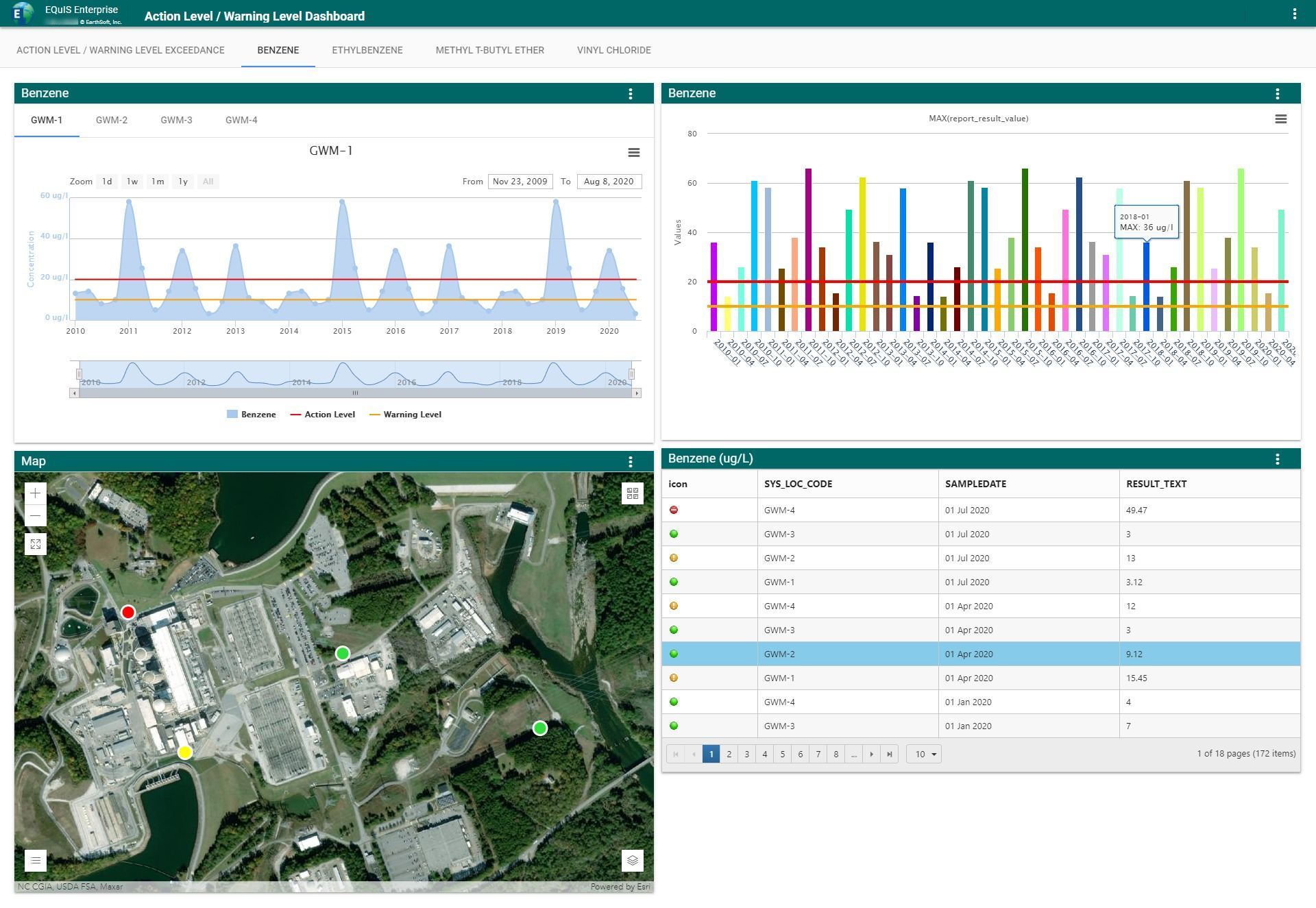
- Groundwater quality
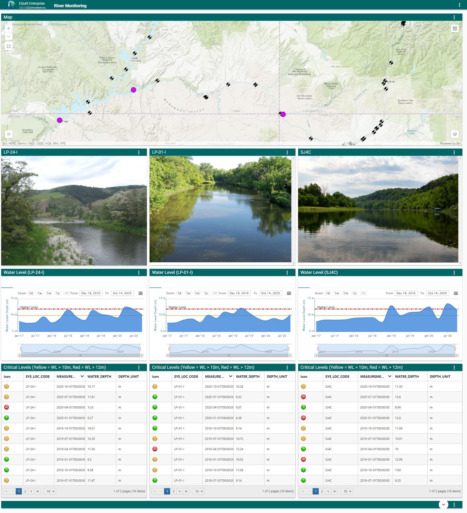
- Surface water quality
- Soil and sediment contamination
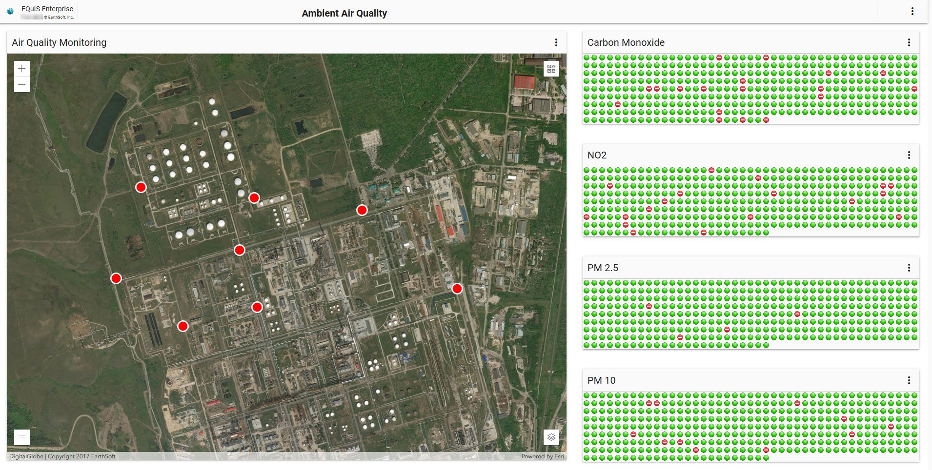
- Ambient air quality
- Stack emissions
- Noise pollution
- Flow rates
- Waste management
- Greenhouse gases
Up-to-the-Minute Visual Insights for Data-Driven Decision Making
Timely access to accurate environmental data is essential. Outdated reports delay action, increase risks, and make regulatory compliance more difficult. That’s why EQuIS dashboards are designed to deliver near-instantaneous updates, ensuring managers always have the latest insights at their fingertips.
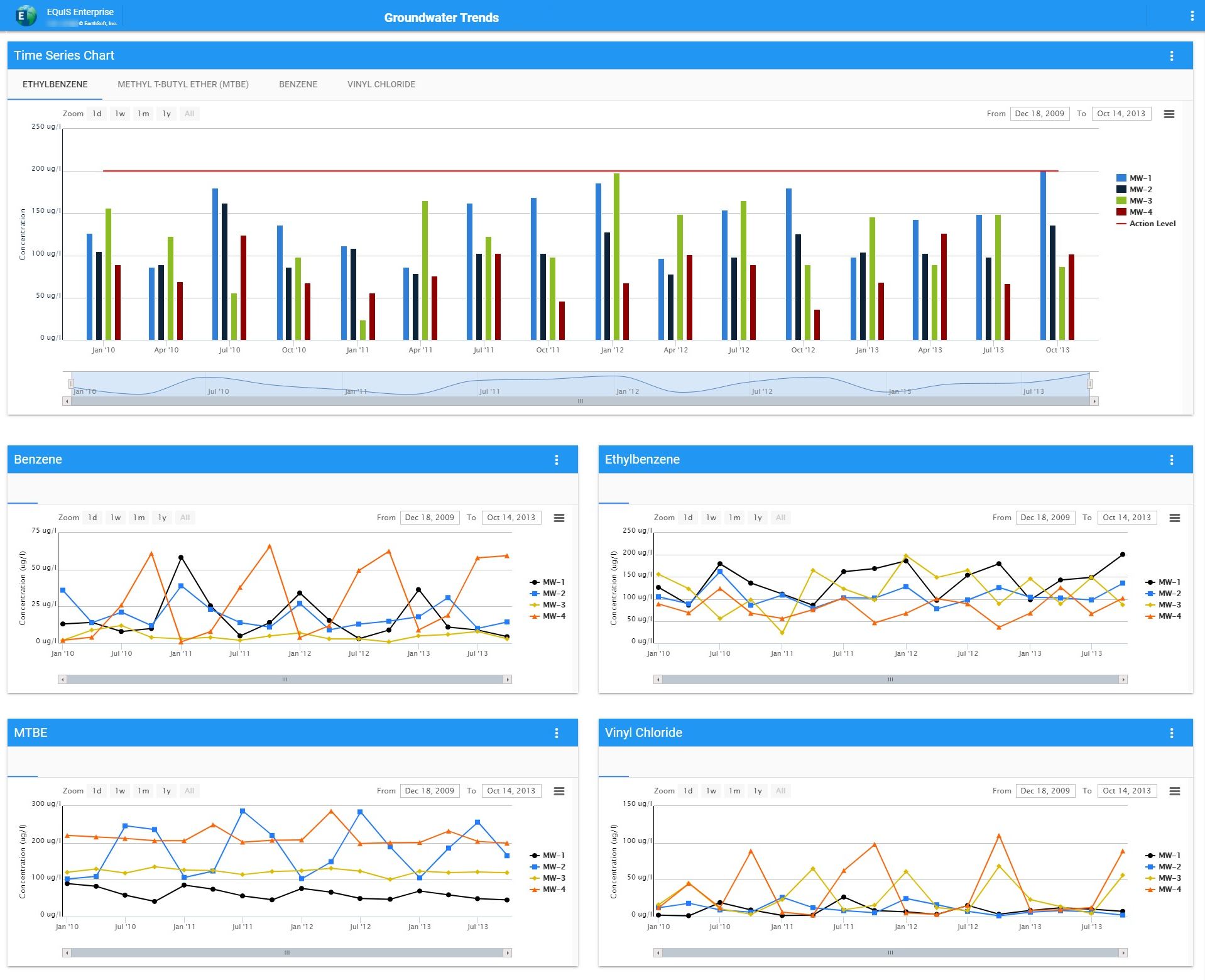
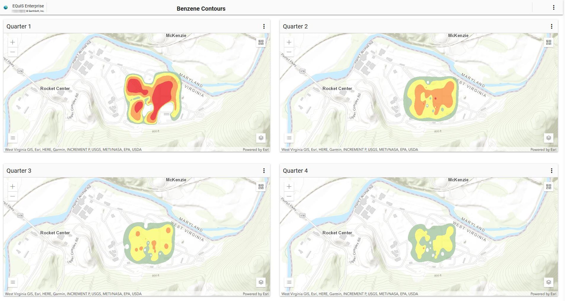
By continuously verifying, integrating, and updating incoming datasets, dashboards keep decision-makers informed with real-time data visualizations, such as:
- Automated time-series charts dynamically display updated environmental conditions.
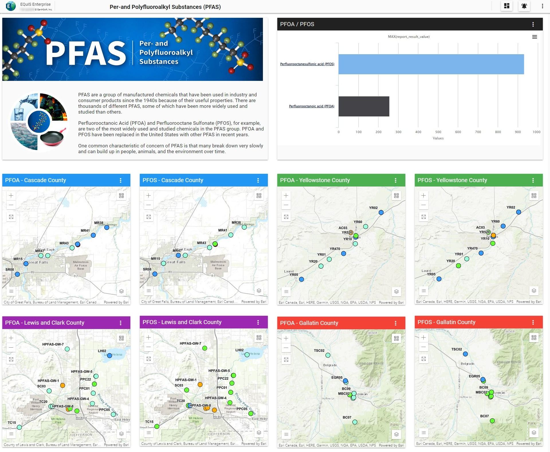
- Geospatial mapping tools provide instant situational awareness.
- System-generated notifications alert stakeholders as soon as new analytical results are available.
Environmental teams can instantly detect compliance violations, analyze ongoing trends, and take decisive action before issues escalate. With up-to-the-minute dashboards, environmental management shifts from passive oversight to active and responsive leadership.
Data Management: The Foundation for Improved Quality and Cost Efficiency
Beyond visualization, dashboards play a pivotal role in enhancing data integrity and reducing operational costs. Organizations that digitize and automate common workflows increase data accuracy, streamline reporting, and cut unnecessary expenditures in data collection and analysis.
By integrating a robust EQuIS data management system, companies replace fragmented, manual processes with automated validation, secure storage, and seamless accessibility. This not only improves compliance tracking but significantly reduces costs associated with labor-intensive data retrieval, verification, and reporting.
Leveraging EQuIS dashboards alongside a strong data management framework leads to higher-quality insights at lower costs, benefiting environmental managers, regulatory agencies, and operational teams alike.
EQuIS Dashboards: A Smarter Way to Navigate Environmental Data
Environmental compliance demands precision, adaptability, and efficiency—all of which are optimized through EQuIS dashboards. By consolidating disparate datasets into a single, configurable interface, dashboards ensure that environmental professionals remain proactive, informed, and responsive.
Put a dashboard on your environmental engine today to gain complete visibility, automate key workflows, and take control of your data.


